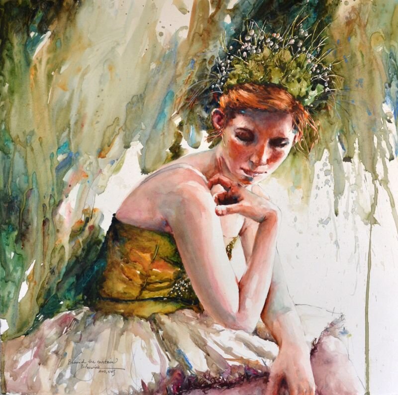
Behind the Curtain by Bev Jozwiak, 2019, Stonehenge Aqua Hotpress 140lb
The style Bev Jozwiak is currently working in seems to be the direct result of her own personal journey. Art has been in her life for as long as she can remember. She is the first formally trained artist in her family, but by no means the first artist. Her great aunts, grandmother, aunt and father all painted before her. She graduated with honor from Western Washington University, with a Fine Arts degree and an Art History minor.
Whether painting in Acrylic or watercolor the goal is the same; to create an impressionistic painting with rich varied color, good design, great values, and to create a piece that will last by using archival materials. She never wants the viewer to think her paintings look like photographs, but rather to see the brushwork, and the love and energy that goes into each and every piece.
Jozwiak’s skill as a painter has garnered her national acclaim as one of America’s premier painters. The result of hard work and years of painting has not gone unrewarded. Bev has had a plethora of successful one woman shows for prestigious galleries. She has lost count of how many articles in major art magazines she has had. She is the author of “Painting Life with Life, a 164 page watercolor book, and has her signature status in every major watercolor society, including the American Watercolor Society in New York. Bev believes in keeping original art affordable and accessible to everyone. She does not foresee a time when she would ever quit painting, or become complacent with what she does. She hopes to always study, grow, and continue on this personal artistic journey.
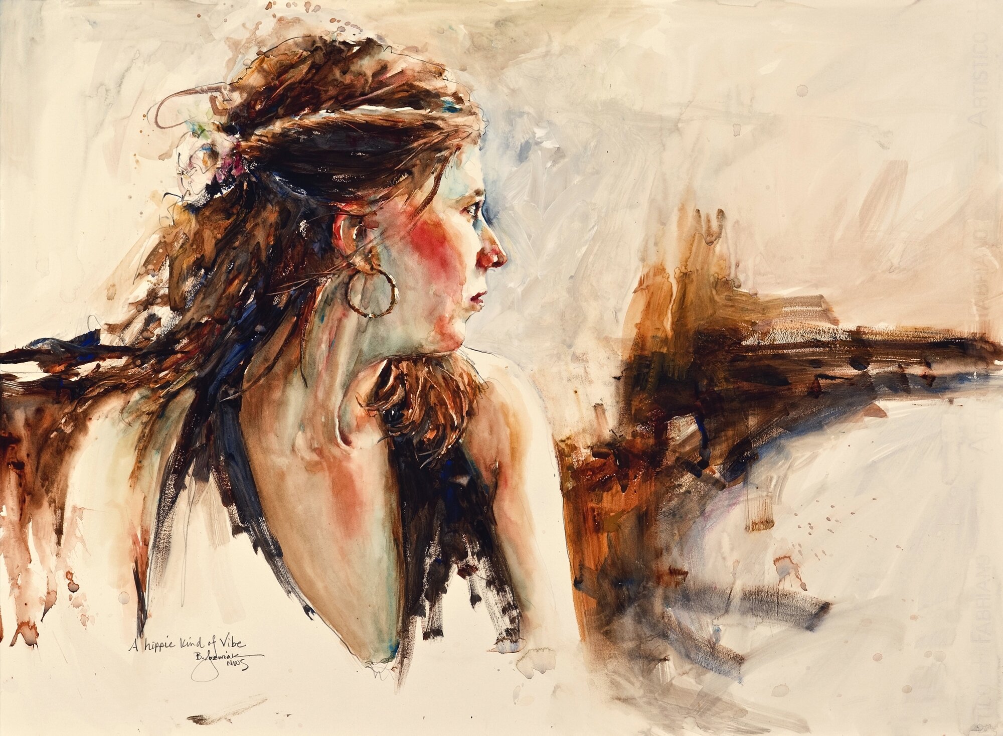
A Hippie Kind of Vibe by Bev Jozwiak on Stonehenge Aqua Hotpress 140lb
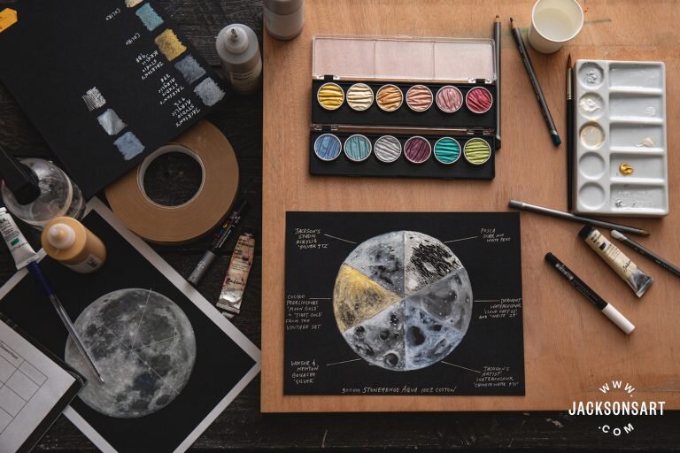
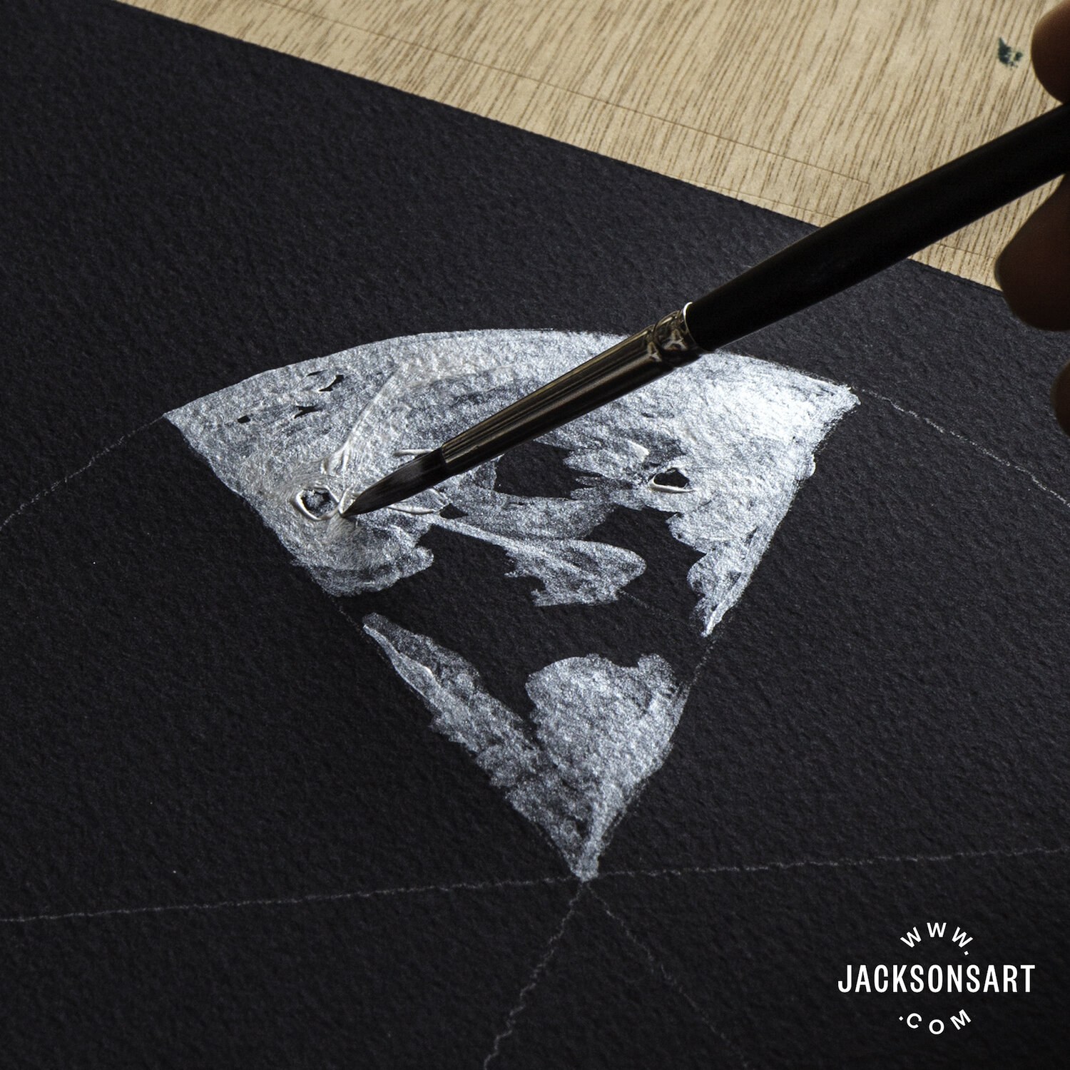
What paper do you use for your work? what do you like about this paper?
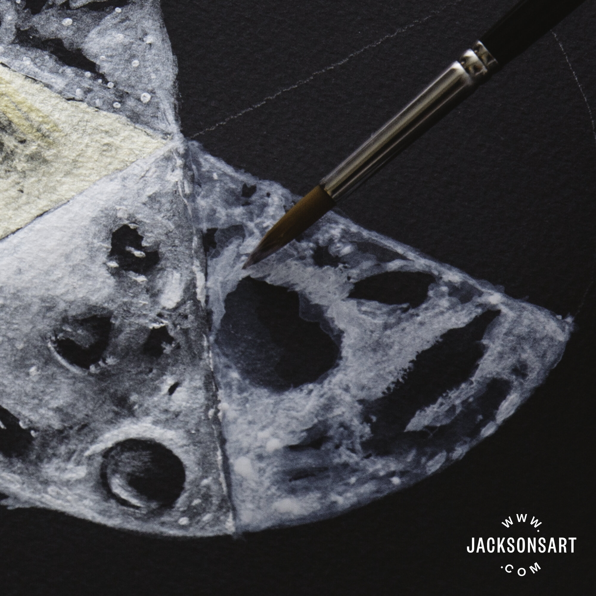
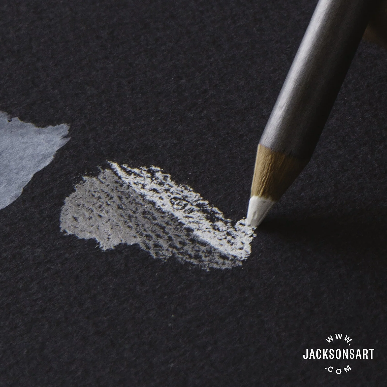
Stonehenge Aqua 140lb. Hotpress is my go to paper. And Occasionally 280 lb. too, which has just a bit more tooth. I have had problems with the sizing on other papers, getting batches that were “pilly” and really hard to paint on. I have not had one bad batch with Stonehenge. It is the just the right amount of slickness.
Why do you choose to work on Hotpress paper instead of coldpress or rough?
Unlike some watercolor painters who paint in thin layers building up to their finished pieces, I use a very direct method of painting. Hotpress is made for this, as the paint lays more on the surface, than with cold or rough papers. It is also very easy to lift out areas of paint, either with a brush for a light touch, or with a magic eraser to really get back to the white of the paper.
What other materials do you use for your paintings?
Palette: Alvin Heritage Palette or John Pike Palette
Paints: (Cheap Joes Art supply is where I get most of my supplies) Online.
Winsor and Newton (unless noted)
Yellow Ochre
Burnt Sienna
Sap Green (Holbein)
French Ultra Marine Blue (I have been using Daniel Smith lately, but either work)
Cobalt Blue
Manganese Blue Hue
Permanent Alizarin Crimson
Rose Madder Genuine (or Permanent Rose)
Cadmium Red (or Joes Red from Cheap Joes)
Cadmium Orange
Winsor Blue (Red Shade)
Winsor Green (Blue Shade).
New Gamboge or Joe’s Yellow (Cheap Joe’s American Journey)
Janet Rose Violet (Cheap Joe’s American Journey)
Aureolin
Naples Yellow
Yellow Gray (Holbein)
Verditer (Holbein)
Don Andrews Turquois
Brushes: Cheap Joes Golden Fleece
#10 round
1” Flat
#4 round for details
· *I also use the legend or the dream catcher (from Cheap Joes) when I need a brush that holds a more water. #8 round is my favorite.
· Kolinsky DaVinci Maestro #12 (A very good mop brush)
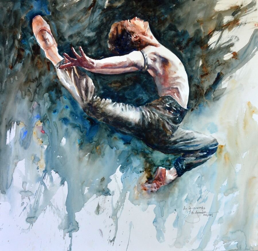
As if on Wings by Bev Jozwiak, 2019, Stonehenge Aqua Hotpress 140lb
What is your process like from start to finish?
I am a very fast and direct painter; as a matter of fact I am almost done with my second book, which is called, “Confident brushstrokes”. While I do have some work that is more layered and “traditional”, my own favorites are the ones with bold confident, purposeful brushstrokes.
Do you have a favorite piece? Why is this your favorite?
It is hard to choose one piece to be a favorite. It is usually a recent piece, and then in a year, I don’t like it at all. I am always growing in my art, and don’t ever want to paint on rote, or get in a rut of painting the exact same thing. I like my crow/raven pieces simply because I love to paint blacks. I add a plethora of colors next to each other, and yet manage to have it still read as the color black.
My ballet pieces are also some of my favorites. My youngest daughter was a professional ballet dancer. I grew to love ballet and all the rituals involved in that art form.
At this very moment my favorite piece is called “Stand Tall”. I was very happy with all the colors in this man’s face. I really wasn’t expecting the painting to turn out, as I was just experimenting with throwing rubbing alcohol at my paper as I was painting. The texture it created was unexpected, and really gave this piece a unique look that I was very pleased with in the end.
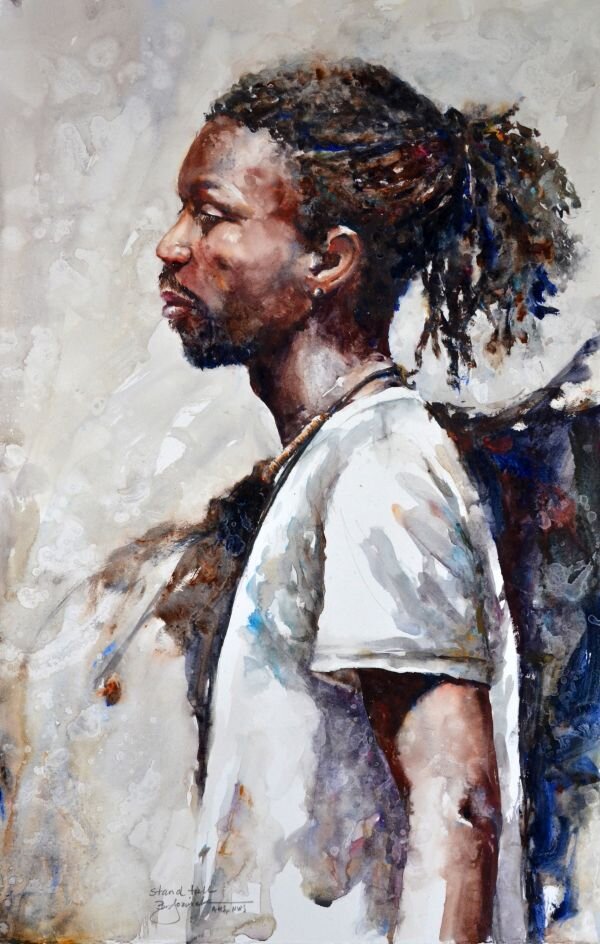
Stand Tall by Bev Jozwiak, 2019, Stonehenge Aqua Hotpress 140lb

Ballet Profiles by Bev Jozwiak, 2018, Stonehenge Aqua Hotpress 140lb
Anything else you’d like to add?
If I could choose to be anything in the world, I would not make another choice. I love to paint. Being an artist is not what I do, it is who I am. Getting to create a thing of beauty, and show the world what I see through my eyes, has been a gift that I am beyond grateful for.
If you have always wanted to be able to paint, what are you waiting for? Start on your journey today. Every day adds a layer of knowledge, brick by brick honing your craft, until you have the skills to say what you want to say. It all starts and ends by putting “miles on the brush”.
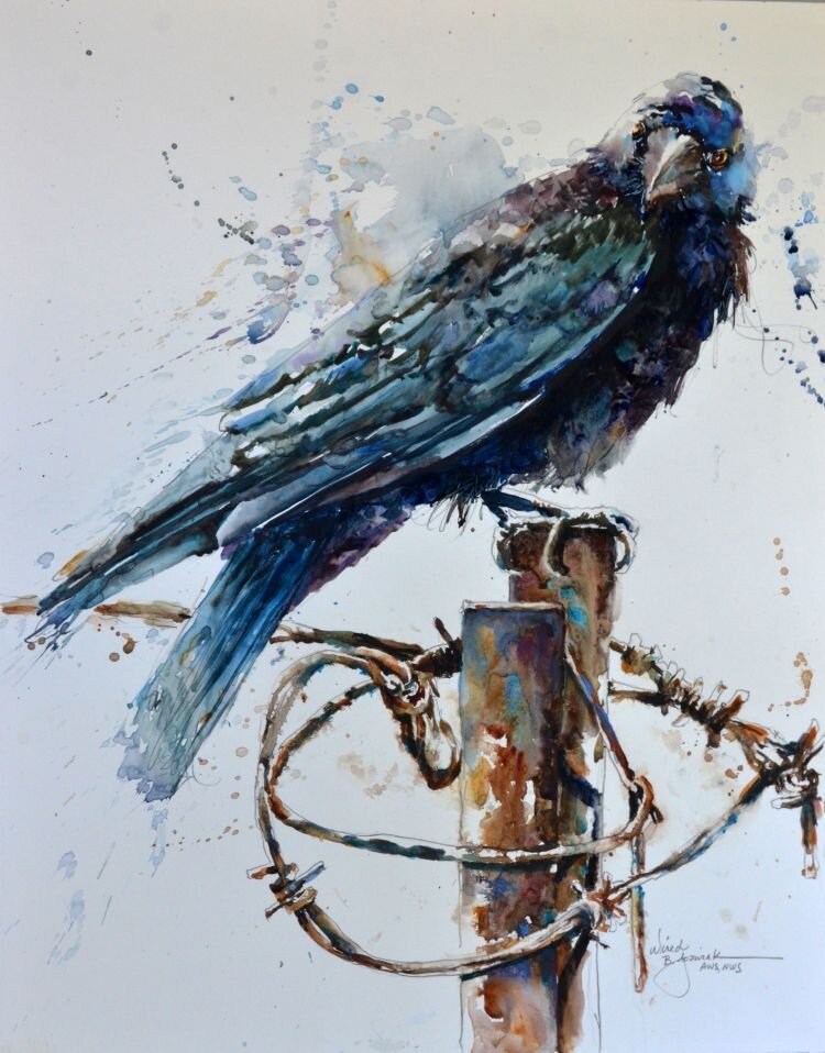
Wired by Bev Jozwiak, 2020, Stonehenge Aqua Hotpress 140lb