Possibilities of Paper - Colorplan, Edition 2

Introducing: Possibilities of Paper - Colorplan, Edition 2, produced in collaboration with Imprimerie Du Marais (Paris, France).

View Edition 1 here.

The second edition in a series of three is in collaboration with French print and production house Imprimerie du Marais to showcase the vast potential of Colorplan through unique and unusual color combinations, paired with production techniques such as silk screen printing, hot foiling, and sculpted embossing. 

A natural evolution from Edition 1, Edition 2 steps back from the micro view of the butterfly to reveal more of the concept image. Edition 2 also showcases a selection of different print techniques and finishes to Edition 1.

Each card has a common design but is produced in different colors. The foil, silkscreen and emboss techniques are precisely registered together. The sculpted emboss is produced using a brass die under heavy pressure on the machine; a 3D preview was created before the die was produced to visualise the detail on screen before production.

Etching Process with Kathryn Anderson

Professional printmaker and printmaking tutor Kathryn Anderson takes us through the print process she uses when printing her etchings.  Kathryn is an ambassador for Somerset paper and is known for her highly detailed prints capturing the beauty and mystery of the natural world.

ABOUT ETCHING (Intaglio)

Intaglio is the opposite of relief printing. I always think of it this way: Etchings print what’s BENEATH the surface and relief prints print what is ON the surface.

Creating etchings is a very old technique. They were first produced around 1500. Some of the great etchers include Durer, Rembrandt, Goya, Degas, Picasso, Matisse and so many more!

An etching is created by incising lines on a metal plate with a corrosive solution and then applying ink to the plate. The ink is pushed into the lines and the surface is wiped clean. Dampened paper is then laid on top of the plate and passed through an etching press under great pressure which pushes the paper into the incised lines and transfers the ink to the paper.

Let’s look a bit deeper into the process!

DRAWING UP YOUR DESIGN

Create your imagery to fit your copper plate. Once you’ve established your design, it can be drawn directly or transferred to the prepared copper plate.

PREPARING THE PLATE

I use copper plates for my etchings. Here are the steps to get it ready to image:

  1. Use standard sized plates or cut the copper plate to the size you want. (I use a coping saw)

  2. File the edges to a nice 45 degree (ish) bevel on top and sand smooth. (So you don’t trap ink there or cut your paper, or press blankets, or yourself!)

  3. Lightly sand the surface to erase small scratches and make the surface very smooth.

  4. Polish the surface of the plate (using metal polish) and de-grease with whiting and vinegar.

Now your plate is ready to be imaged!

CREATING LINEWORK

In this step we will create linework and etch the copper plate with Ferric Chloride.

There are different ways to do this, but this is what I do.

  1. Make sure your plate is clean and free from oil.

  2. Apply a ‘ground” which resists the Ferric Chloride. I prefer hard ground for fine lines.

  3. Draw your lines with an etching needle through the hard ground to expose the copper.

  4. Cover the back with an acid resist that doesn’t scratch off, either varnish or adhesive backed shelf liner.

  5. Submerge your plate in Ferric Chloride to etch the plate. The length of time in the Ferric will determines the depth of the line. Deeper lines hold more ink and print darker.

  6. Remove the plate and clean the ground off with mineral spirits.

You’re ready to pull your first print!

PRINTING THE ETCHED PLATE

The first step is to print a proof of your etched linework plate.

  1. Apply etching ink to the etched plate surface and work it into the lines. A matboard tab can be used to spread the ink and remove the excess.

  2. With a combination of wiping with stiff cheesecloth (Tarlatan or other wiping fabrics) and newsprint paper the surface ink is removed leaving the incised lines with ink. You can also choose to leave a thin layer of ink to create tone.

  3. Don’t forget to clean those beveled edges!

  4. Place the copper plate ink side up on the etching press.

  5. Blot your dampened paper and lay it on the plate.

  6. Put a sheet of newsprint on top and roll down the felt etching blankets. There are three blankets on an etching press: the sizing catcher, the cushion, and the pusher on top.

  7. Engage the press to apply pressure to the paper covered plate. This pressure will push the dampened paper into the plate and transfer the ink to the paper. The pressure will also create a “Plate-mark” which is the hallmark sign of an etching.

  8. Gently lift the blankets and newsprint and carefully lift the paper off the plate.

VOILA!! You have your first proof!

At this point I decide what comes next. Do I like the line proof as is, or do I want to add tonal values?

CREATING TONAL VALUES

There are lots of ways to create tonal values on your plate, my favorite is Aquatint.

Aquatint is an etching process that creates a texture that is etched into the plate to hold ink. It can be done with traditional powdered rosin or with the more recent method of spray paint. I use rosin

(Note Rosin can be hazardous if inhaled, so always wear gloves, mask, and eye protection when using)

  1. Clean and degrease the line-etched plate

  2. Apply powdered rosin to the surface and heat until it begins to melt and adhere to the plate.

  3. The tiny dots are resistant to the Ferric and create a texture that holds ink. The longer you submerge the plate the deeper the etch and thus the amount of ink it holds.

  4. A series of tonal values can be achieved by blocking of the lightest value on the plate (I like permanent Markers of varnish) and dipping in the Ferric for a short time. After the plate is removed from the Ferric you can block out the next area of lighter tone and etch it again. You can do this for multiple times to create a full range of values. (Note: It is VERY important to run a test plate to better understand the timing of the etch and the resulting tonal value.)

  5. After you have finished creating your tonal values you need to remove the aquatint (Soaking in denatured alcohol works well) and you are ready to print!

THE BIG REVEAL!!

Ink up your plate and print as you do with the line etching. VOILA! Your beautiful etching!

There are other methods of creating intaglio work including drypoint, mezzotint, photogravure, heliogravure, and engraving.

AN IMPORTANT NOTE ABOUT PAPER

It’s very important to use the right paper. Etching paper needs to be soaked in water for at least 30 minutes (depending on paper type) and gently blotted just before printing.

Etching paper must be soft but strong under pressure.

My favorite Somerset Paper for etching is Somerset Textured. It comes in cream, white, and softwhite and prints BEAUTIFULLY! It has just the right amount of sizing and prints wonderfully on even the most delicate images. Somerset Velvet is another excellent choice for very fine work with its smoother texture.

IN CLOSING

Etching is a challenging and extremely rewarding printmaking method. I have to admit, it’s my favorite medium for creating prints. (I love a challenge!)

There are lots of variables in this process, but using the best papers takes some of the guesswork out of the equation and makes printing a joy!

Featured Artist: Charcoal Artist, Nicholas Lantz

Through the Legion Artist Program, Nicholas Lantz tested a variety of papers for his charcoal work. At Legion, we always suggest testing several papers, as each artists hand is different and will find different results.

Learn more about Nicholas Lantz’s work and his journey exploring different surfaces.

“I was really surprised how differently these papers performed given how similar they looked. I expected there to be minor differences, but each paper had its own characteristics.”

Tell us about yourself and your work.

My name is Nick Lantz, I am an artist currently living in Cleveland Ohio. During the day I work as an electrical engineer doing research and development for various space-based systems. Art is a bit of therapy in that regard. Art gets me away from the computer, lets me turn off the rules and use my intuition.

My work evolves from year to year as my skill level and taste change. I think I’ve always been chasing the same type of work and style, but I still haven’t totally found it yet.  The journey continues. I’m really inspired by artists like Jeremy Mann, Zin Lim, Carolyn Anderson, Steve Huston, Jacob Dhein, Roberto Ferri, Mancini, and Fechin to name a select few.  I work a lot in charcoal, mostly because it fits my life better than wet media. I can pick up a stick of charcoal for 15 minutes when I have the time and I don’t have to worry about paint drying too fast or setting up a palette.

Nicholas Lantz testing Stonehenge Oil without Primer

Which papers from Legion did you test out?

Legion sent over a bunch of papers for me to test including Stonehenge, Stonehenge Aqua Hot Press, Stonehenge Oil, Rising Museum Board, Rives Heavyweight, Somerset Satin, Coventry Rag Smooth, Drawing Bristol Vellum, and Drawing Bristol Plate. I also had some Yupo laying around that I added to the stack for fun.

Which papers did you find worked well for you work? what did you like about these papers?

I was really surprised how differently these papers performed given how similar they looked. I expected there to be minor differences, but each paper had its own characteristics.

My favorite paper of the group was the Stonehenge Aqua Hot Press. This paper produces a really nice willow stroke, but when you blend out an edge, you get an amazingly soft transition with just a finger swipe. It sucks up the charcoal dust and doesn’t let go. It also takes to a kneaded eraser with the best of them. More interesting is that it’s a watercolor paper. This opens up a whole area of wet charcoal techniques, including acetone, which usually warps the paper a bit. I’m excited to work with this paper some more.

I also like Stonehenge Oil, which is a really interesting product. Unprimed, you can get an interesting mat finish from the oil sinking in a bit. It accepts layers really well wet-on-wet. I think you could achieve some highly detailed and realistic works with this paper. I have also primed it which results in a wetter, juicier look. Just be a little careful if you use tape to mount the paper for painting like me. It’s cotton, and mild strength tape can pull off the top layer. Clips or magnets are probably a better tool.

The Yupo was a real surprise with oil paint. Talk about juicy brushstrokes! There’s something there, but it’s a little uncontrollable for me. I’m certainly going to experiment more.

I’m also a big fan of the classic Stonehenge. This is the best graphite paper I’ve found.

Nicholas Lantz testing Stonehenge Oil with Primer

Any papers you found challenging?

I found the Bristol Plate a bit difficult to work with in charcoal. This may be a good paper if you prefer compressed charcoal over uncompressed. It just didn’t hold the willow dust very well. The Coventry Rag paper also produced a very wide texture. Not a bad thing, it just doesn’t fit me.  

What materials did you use on these papers?

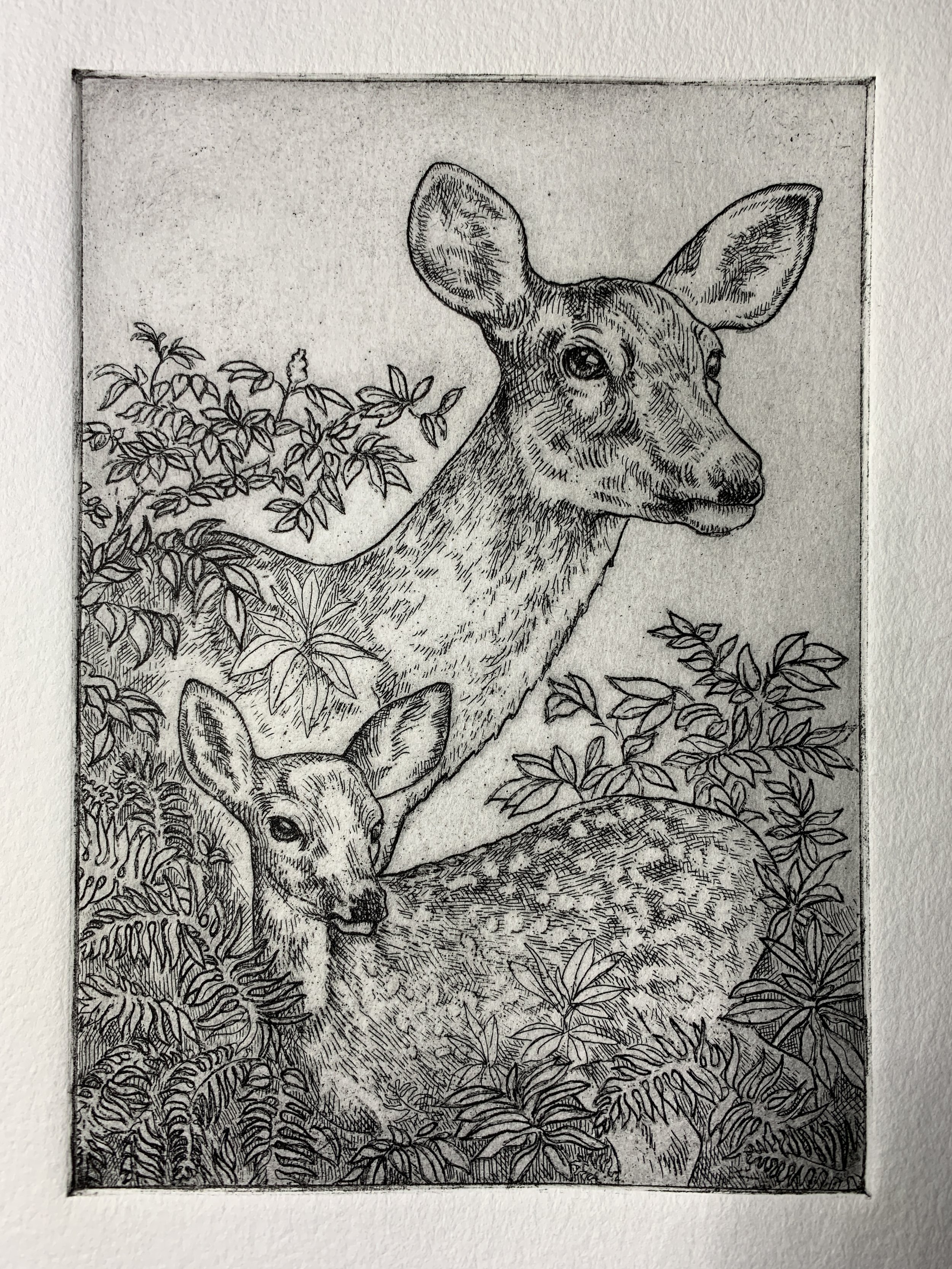
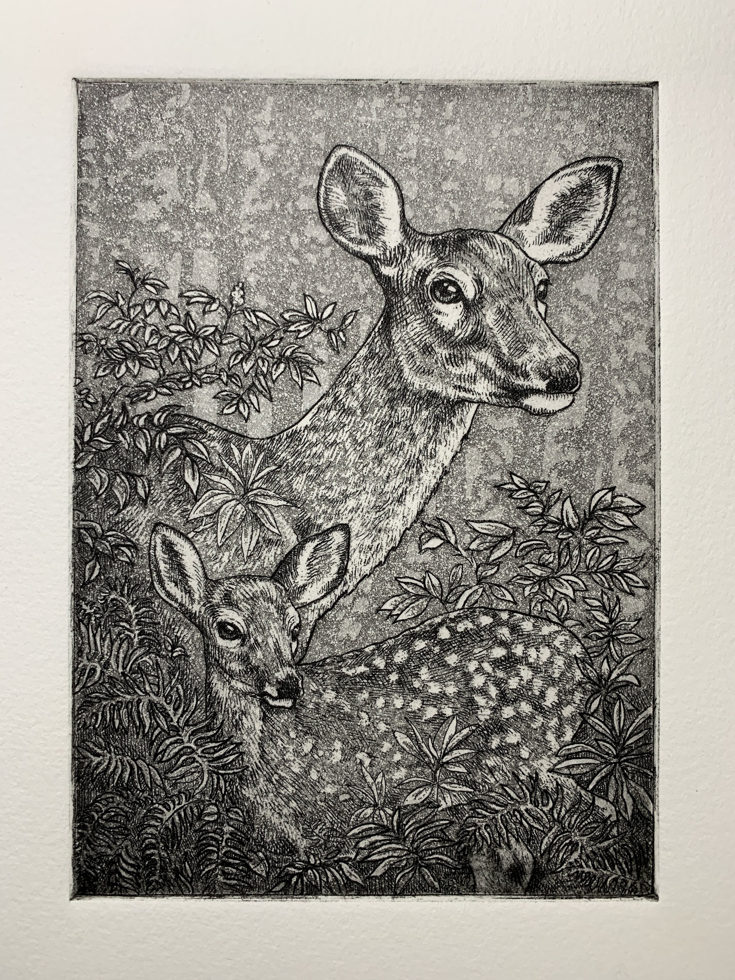
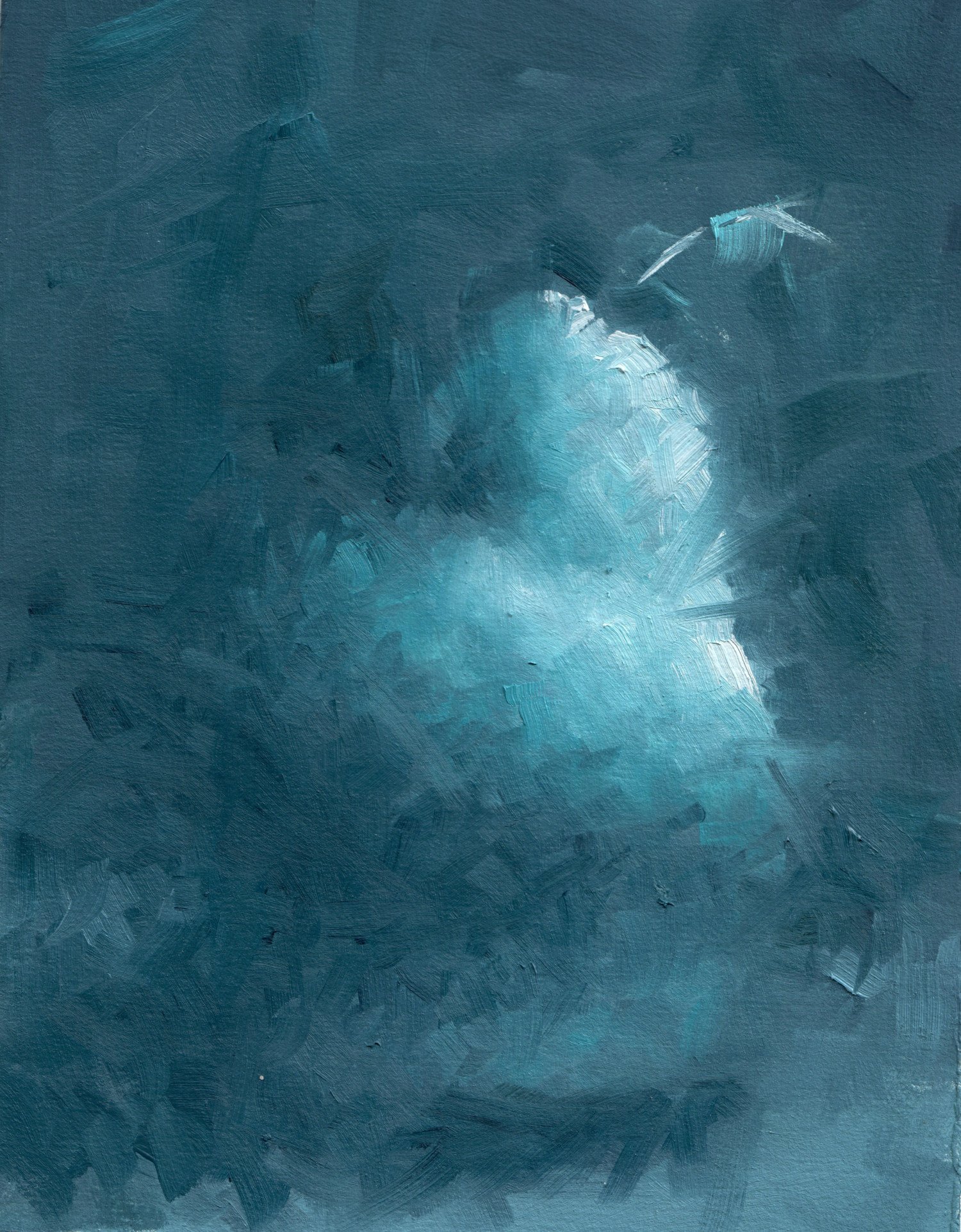
I used vine, willow, and compressed charcoal on all the papers with the exception of Yupo. I tried Oil paints on most of the thicker papers. I tried oiling out the paper in spots, thick paint, thin paint, galkyd and gamsol washes. I also tried it with gesso.

What characteristics do you look for in a paper? How does paper play a role in your work?

I prefer to use archival papers whenever possible. This isn’t because I think all of my pieces will be around for 100 years, but it puts me in a different mindset when I work. I put in a little more effort and patience when I know the substrate will last. If I’m working on a paper that I know will yellow, I get thoughts like “this is good enough, it won't last anyway”.  This headspace obviously doesn’t produce the best results.

I also prefer a substrate that’s ready to go out of the box. I don’t want to spend my painting time prepping canvases.

Additionally, for charcoal paper, I’m looking for a few extra things.

I want the directionality of large vine/willow strokes to be preserved. Sometimes when you tone an area, you lose the directionality. I can always remove it manually. But that should be my decision, not the papers. Second, I need the paper to hold onto that loose wispy charcoal dust. This really comes into play when blending out soft edges. If the paper doesn’t hold the dust well, even the blender will create hard edges. Third, I need to be able to create a flat tone relatively easily. I like my charcoal work to have a select few highly rendered areas akin to Bargue plates and traditional cast drawings. The paper has a lot to do with achieving this super flat tone.

Any upcoming projects we should look out for?

Is this a challenge? Haha. No, nothing specific. I’m starting to shoot my own reference material, where I can control the lighting and pose. I’m excited to see what finished work comes out of that. We’ll see!

Graphite on Stonehenge White 250gsm by Nicholas Lantz

I think the biggest question might be “why paper at all?” I have always preferred paper because it takes up almost no room when finished. If I painted 100 canvases, they would take up a whole closet. How many friends do you have whose hobby takes up their entire garage? With paper, I can store years’ worth of work in a small museum box. And it’s still ready to throw in a frame at any time. It's also a lot less expensive than other materials. Win win. 


The Possibilities of Paper - Colorplan

The Possibilities of Colorplan - Edition 1 of 3, in collaboration with Swiss Printer, Sonderegger.

Colorplan represents an exceptional achievement in paper making. Over the last 80 years Colorplan has been continually refined, perfected, and pushed the range to its limits. Every one of its 55 colors, optional embossings and 10 weights is made sustainably, in Great Britain. It can adapt to endless transformations, from boxes to business cards, paper bags to works of art.

Possibilities of Paper - Colorplan explores the subject of Butterflies. Butterflies conjure up images of sunshine, the warmth and color of flowery meadows, and summer gardens teaming with life. A perfect subject for creative expression on Colorplan.

Colorplan Hot Pink

Colorplan Hot Pink

Colorplan Purple

Colorplan Purple

Colorplan Citrine

Colorplan Citrine

With a staggered release, the 3 editions mimic the life cycle of a butterfly. Starting from a view of immense detail and abstraction, each one gains more context graphically until its fully fledged final form is revealed, culminating in a final unveiling of a beautiful butterfly.

To really showcase the vast potential of Colorplan, we wanted to explore numerous print techniques. These techniques, when applied to Colorplan create beautiful print pieces that you want to explore, hold, study and feel.

We have created unique and unusual color combinations, presenting an artful and expressive printed reinterpretation of the original butterfly imagery.

Print Production notes:

Outer case - Colorplan Racing Green 350gsm. Debossing of butterfly wing detail, with KURZ Laser foil.

Inner sleeve - Colorplan Mandarin 270gsm. Intricate raster lasercut on frontside of sleeve with embossed text.

Cards - Utilising Hot Pink, Citrine and Purple stock; showcasing 3 foil blocks; Holographic, Metallic Silver, and Metallic Gold. We have also overprinted ink on top of silver foil to create an unusual shimmering color in specific parts of the print.

Rethink Color, Composition and Corners with YUPO Round

With YUPO Round artists can reshape, rethink, recompose and reimagine everything and create anew. It’s a revolution that cannot be cornered. YUPO opened a door of creativity with YUPO Round, taking that slick, beloved tree-free medium and literally reshaping it.

Learn more about how artist, Courtney Patterson, uses YUPO Rounds for her artwork.

What do you find appealing about the Round shape?
I love the shape of a Yupo Round. Circles are a soft shape and the roundness aspect often adds warmth and interest to a work of art. Circles are also omnipresent in the natural world and I try to include a sense of nature in every piece. The natural world is where I find most of my inspiration.

Does the shape affect the way you work on YUPO?
It absolutely does! I base the direction of the artwork on both the size and the shape of the paper. I really enjoy adding an accent tone to most of my work with alcohol ink (usually a metallic - silver, brass, rose gold, or gold). Depending on the shape and size of the paper, I will either increase or decrease the amount of accent tone I use.

How do you display a finished piece on YUPO Rounds? Do you mount the piece? Do you seal and protect your finished piece?

After the ink has dried on the YUPO Rounds, I use a finisher to set the piece. My varnish of choice is Lascaux 2070 Acrylic Fixative Spray. Often, the alcohol ink will dry with a high gloss and pigment finish, so for me, it is crucial that the varnish is non-yellowing and clear. I always want the natural pigments of the ink to stay intact and for the piece be as vibrant as possible. I let the artwork sit for a few hours before starting the mounting process, I like to mount the YUPO Rounds on cotton board. I then get the board and the spray adhesive beside me, along with some liquid glue. Once I have everything ready to go, I get started by flipping the YUPO Round over and spraying the back of the paper with the adhesive.

I then flip the paper so that it's upwards and adhere it to the center of the cotton board. I carefully press down with my hands and ensure every part of the paper has adhered correctly. In the rare case that it hasn’t, I keep liquid glue (Lineco Neutral pH Adhesive) beside me so more adhesive can be added to the corners of the round if needed. Once the piece has been finished and adhered, I have a rough idea of how it will look framed. Framing is a whole other process, I think it’s important to find a style and tone that best compliments the piece. There are thousands out there, so it’s always enjoyable hunting down the right one. Sometimes a simple moulding suits the artwork best and other times a frame with a little more character compliments the art just right.

 What your favorite media to use on YUPO?
My favorite media to use on Yupo paper is definitely alcohol ink. For the primary colors I use on YUPO Rounds, I enjoy using COPIC ink refills in the 12ml bottles. I drop them onto the YUPO Rounds and use a heat gun to drive the flow and direction of the piece. COPIC carries a variety of beautiful colors and shades. For the metallic accent tones, I usually use Jacquard Piñata Alcohol Ink.

Any struggles you come across with YUPO / any advice for other artists?

There are not too many struggles when it comes to YUPO. Alcohol ink tends to dry quite quickly on non-porous surfaces, so sometimes going back and fixing what we might see as mistakes can be quite a challenge. Although, I often think what we initially see as mistakes can be the most unique or beautiful part of a piece, it can be best to avoid redoing anything and just see where it takes you! It is a good way of pushing you to be okay with being imperfect when it comes to creating. My advice is even if you do not like how it’s turning out at the beginning or midway through, just keep going and you might surprise yourself!

YUPO Medium Round is available in 74lb/197gsm, in both 8" and 12" diameter.