
Through the Legion Artist Program, Dennis & Christina Jacobs tested a variety of papers for their screenprints. Read more about Arsenal Handicraft’s findings as they dive into this paper exploration.
Arsenal Handicraft is a husband and wife illustration / screen printing due based in Michigan. They work in their home studio illustrating and designing hand pulled screen prints with a focus on using unique pigments, such as those that are metallic or glow in the dark. We have been printmakers for about 15 years and our first printmaking project was our wedding invitations. We sell our prints in galleries and shops throughout Michigan as well at Midwestern art fairs throughout the Summer and Fall.
What are some important factors you consider when choosing a paper for your screenprints?
We use water based inks which require study paper to prevent warping when printed with large floods of ink. Also sturdy papers distort less, making registration of multi color prints easier. We also like to incorporate the color, texture, and finish of certain papers into the designs of our prints. For example we've used Mirri paper to simulate outer space and the night sky. We've also used Colorplan New Blue as the basis for a dusky evening scene.
Which papers did you test?
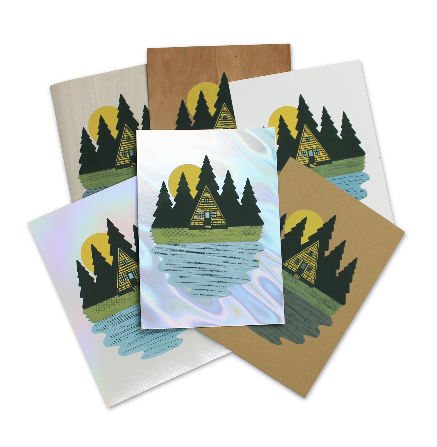
We tested: MirrI Holo Blanco Pearl, Timberluxe Cherry, Timberlux Birch, Mirri Sparkle Glitter (Twilight and Black), Coventry Rag White Vellum, Stonehenge Kraft, Mirri Matte Lava, Stardream, and Colorplan.
Other tools used testing: Acrylic screen printing ink, screen printing screen, squeegee.

Coventry Rag

Timberluxe

Stonehenge Kraft

Mirri Lava
What was your process in testing these papers?
We wanted to test how our acrylic screen printing ink would work on different papers. This includes the smoothness of the printing, how well the ink adhered to the surface, and how opaque and transparent inks performed on the papers. We designed a three color screen print of an A-frame cabin in the woods. The inks used were an opaque yellow, an opaque dark brown, and a transparent blue.
Which papers were your favorites? Why?
Mirri, Stardream, and Timberluxe were our favorites to use because of the way that their unique appearance can enhance our designs. Also, the Coventry Rag and Stonehenge were wonderful to print on and produced fantastic results when we needed a standard heavyweight paper.
Did you find any papers didn’t work well for your process?
The foil paper gave us great results aesthetically, but there were some issue with the ink being somewhat easy to scratch off of the foil sheets. I believe that this can be fixed with a more robust type of screen printing ink, or additive. Many print shops print successfully on foils, so the issue we experienced was most likely caused by our ink.